
EdFed


EdFed
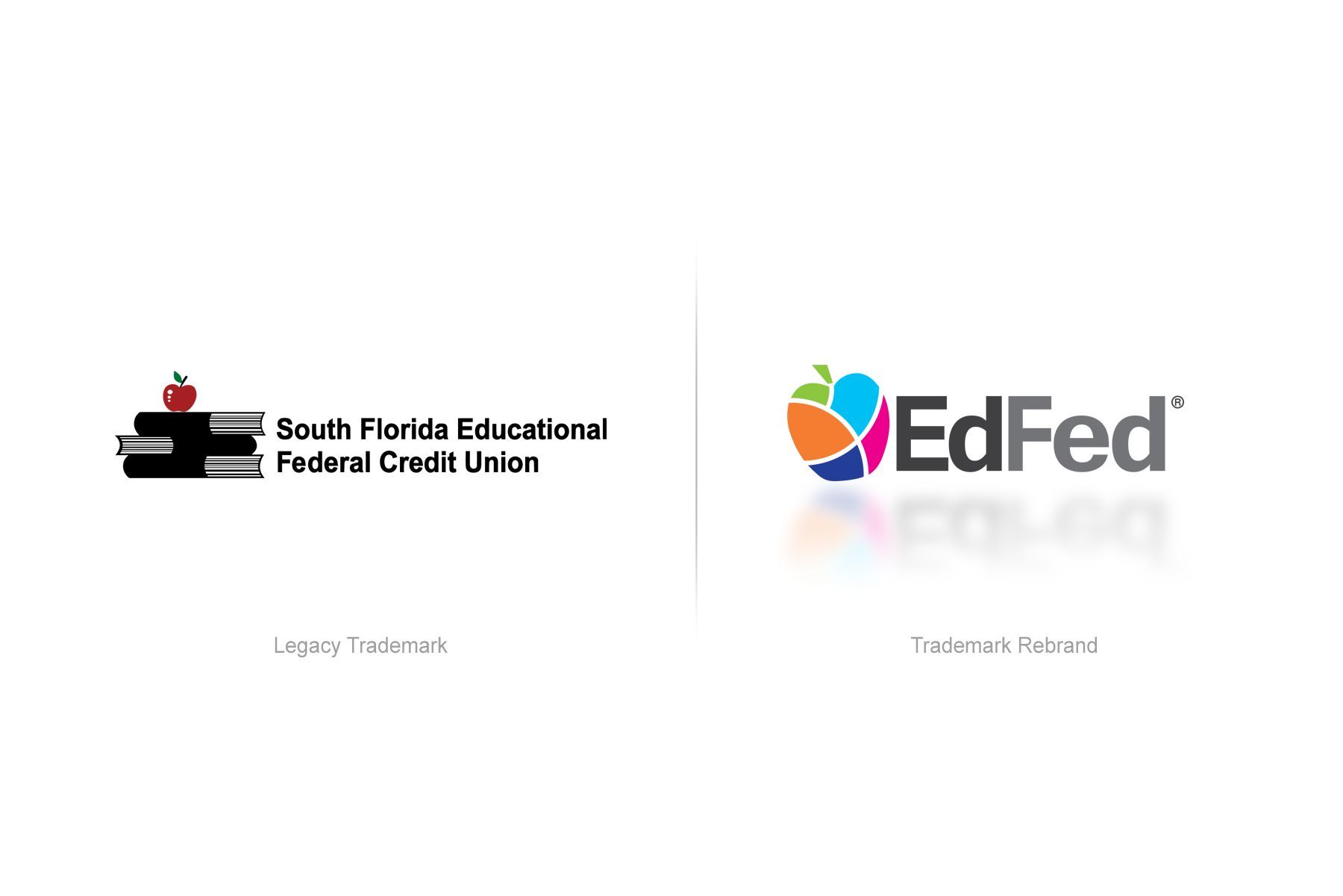
EdFed initially turned to Leftfield in 2019 seeking to overhaul their logo as they transitioned from their decades-old handle, The South Florida Educational Federal Credit Union, to the more modern and concise, EdFed. The chain of credit unions founded by and benefitting the educational community and their families had been a high profile pillar of the South Florida area since its inception in 1935. However, this institution was now ready to set their sights on regional growth and, in short order, national expansion.
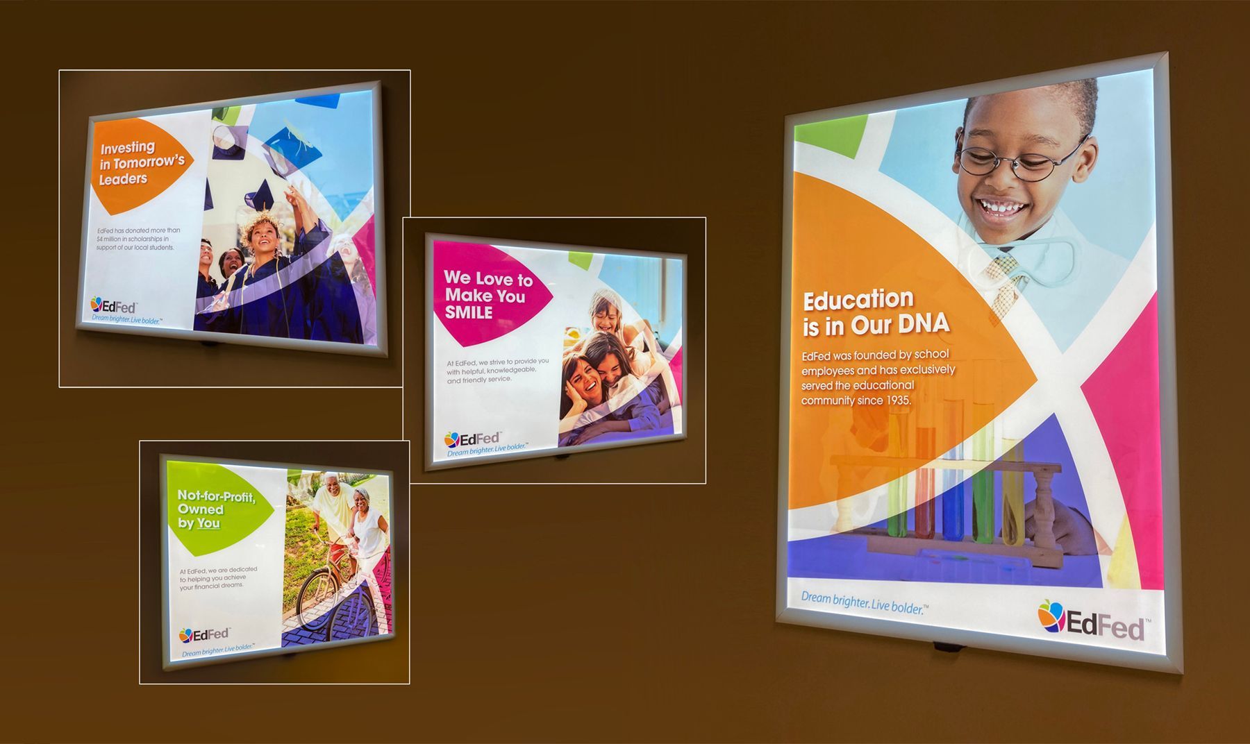
The new and easier to digest moniker required a visual interpretation that better represented the rapidly changing and inclusive landscape of the community. It also had to reflect the bright and vibrant South Florida aesthetic without alienating the sensibilities of those in the credit union’s slotted new markets.
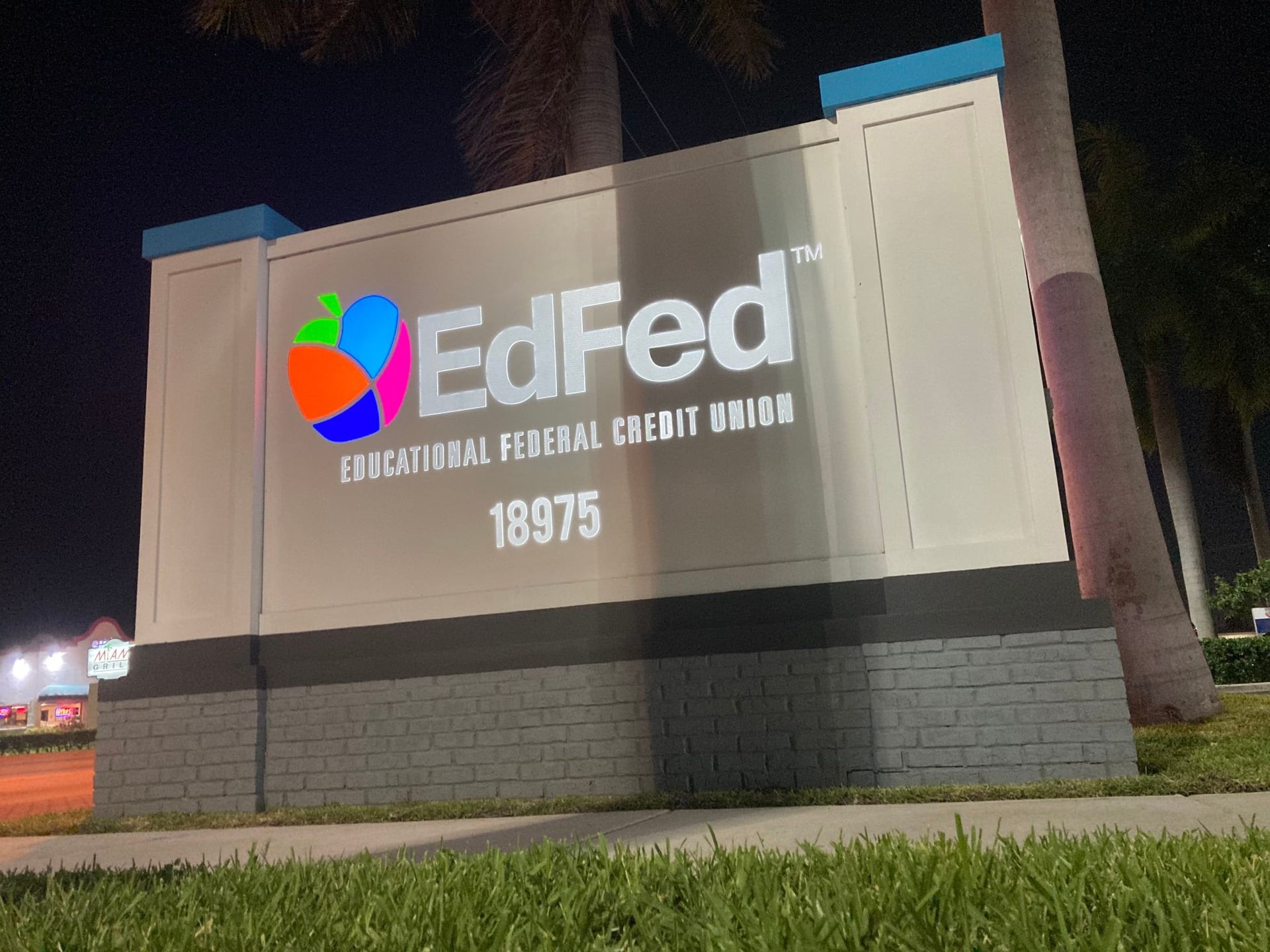
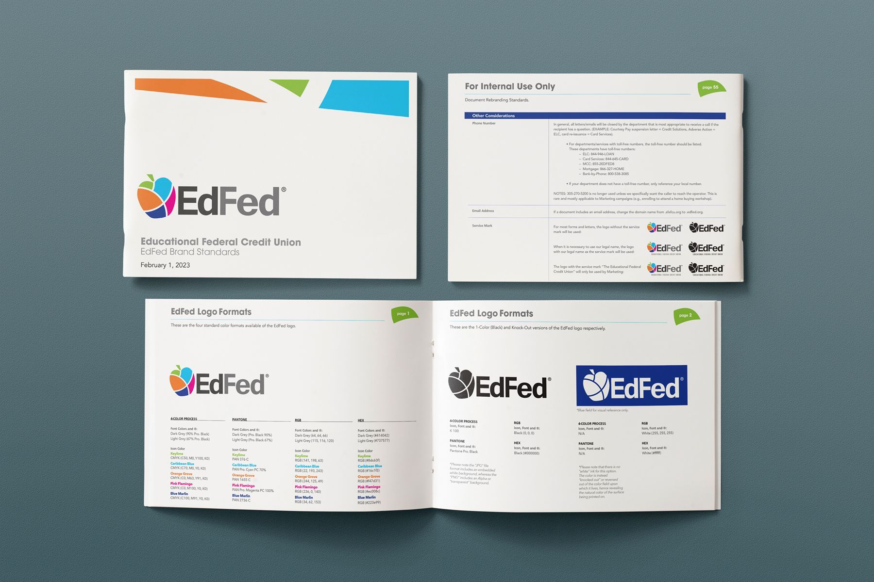
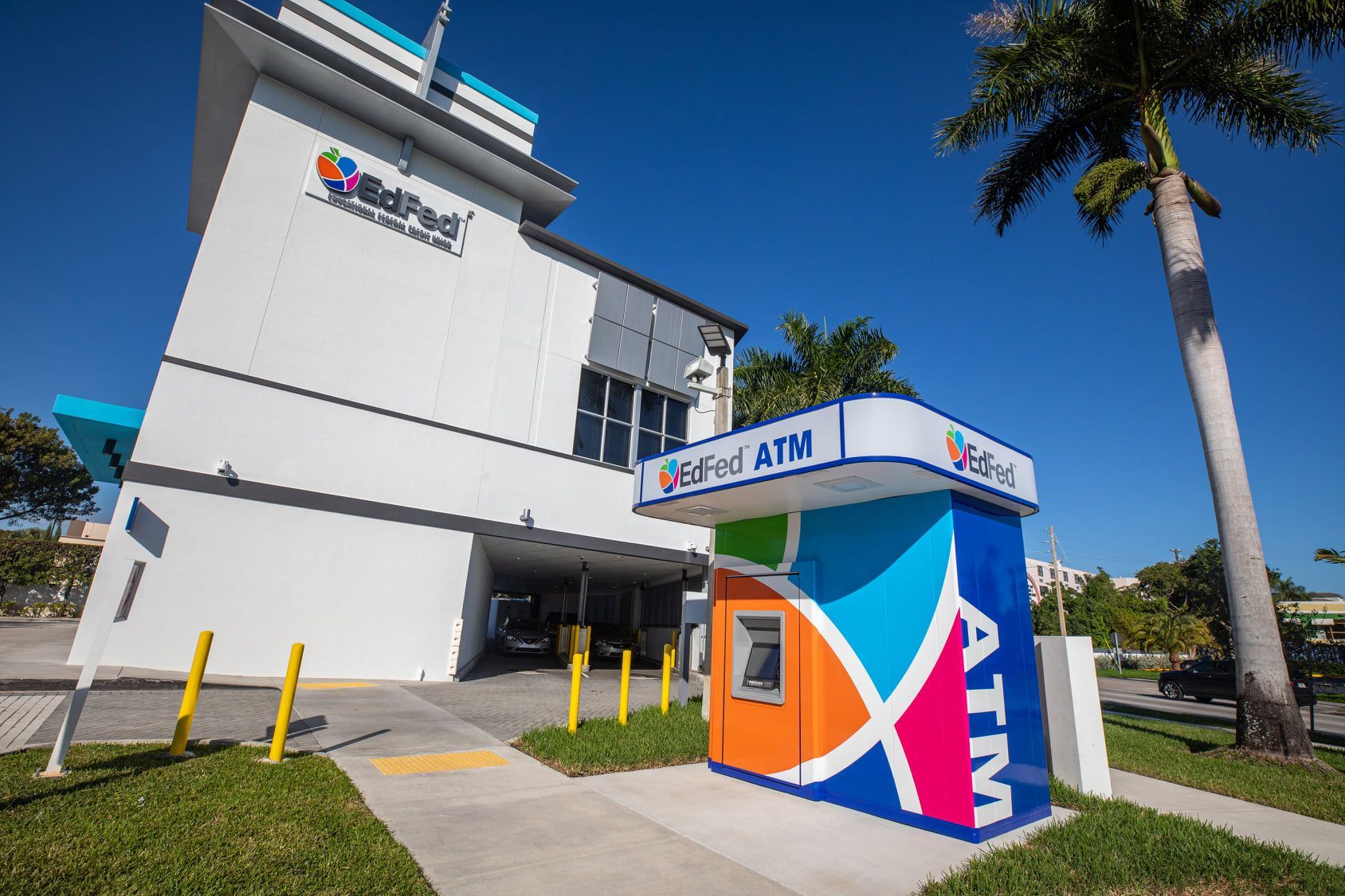
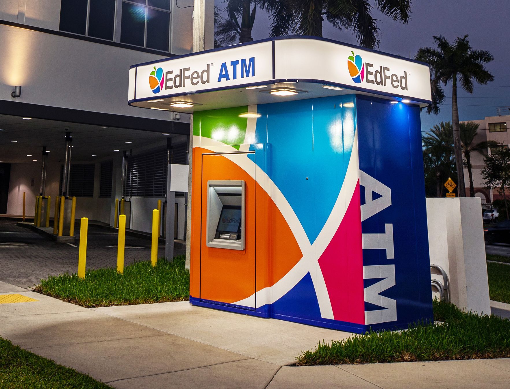
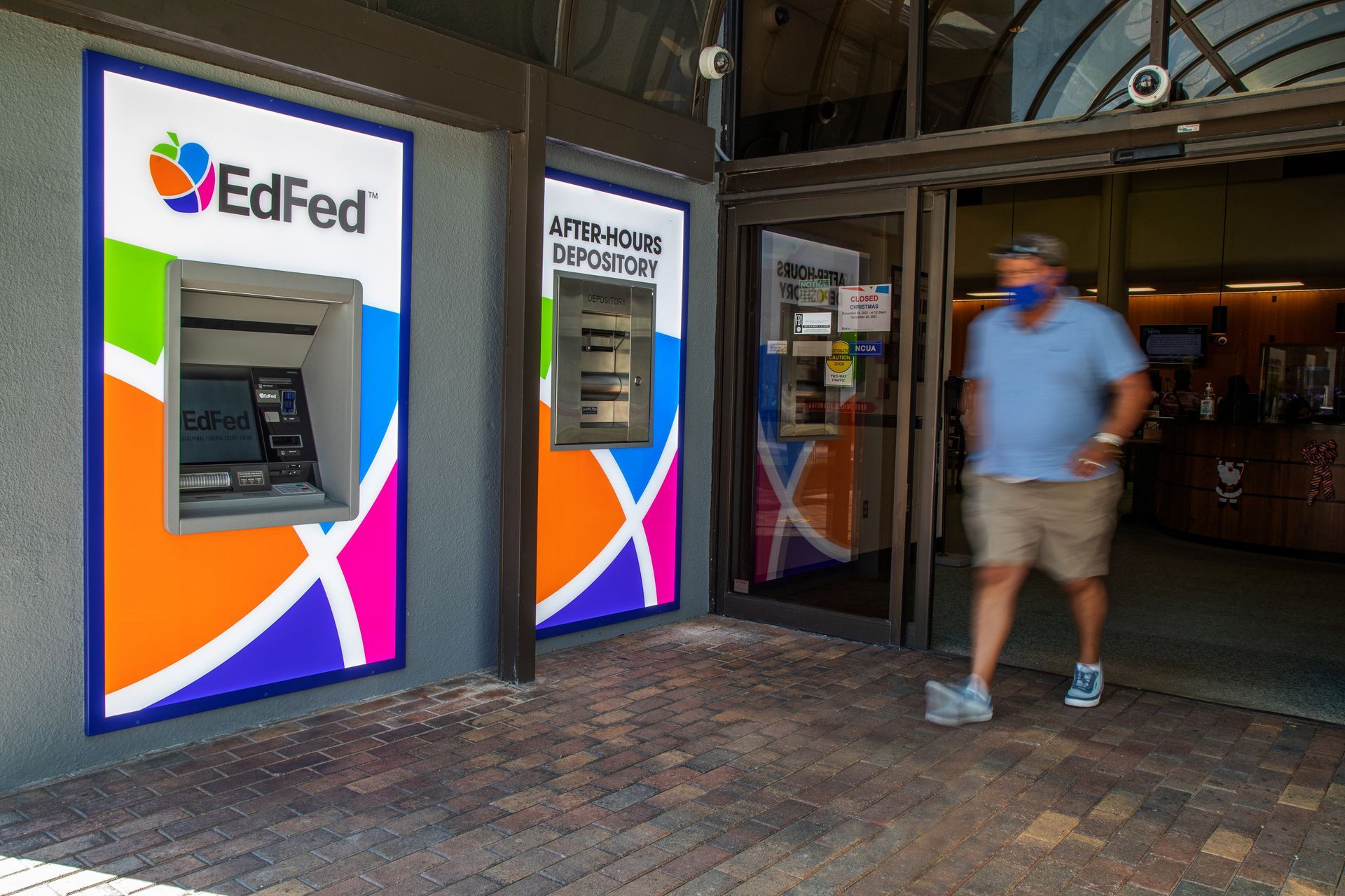
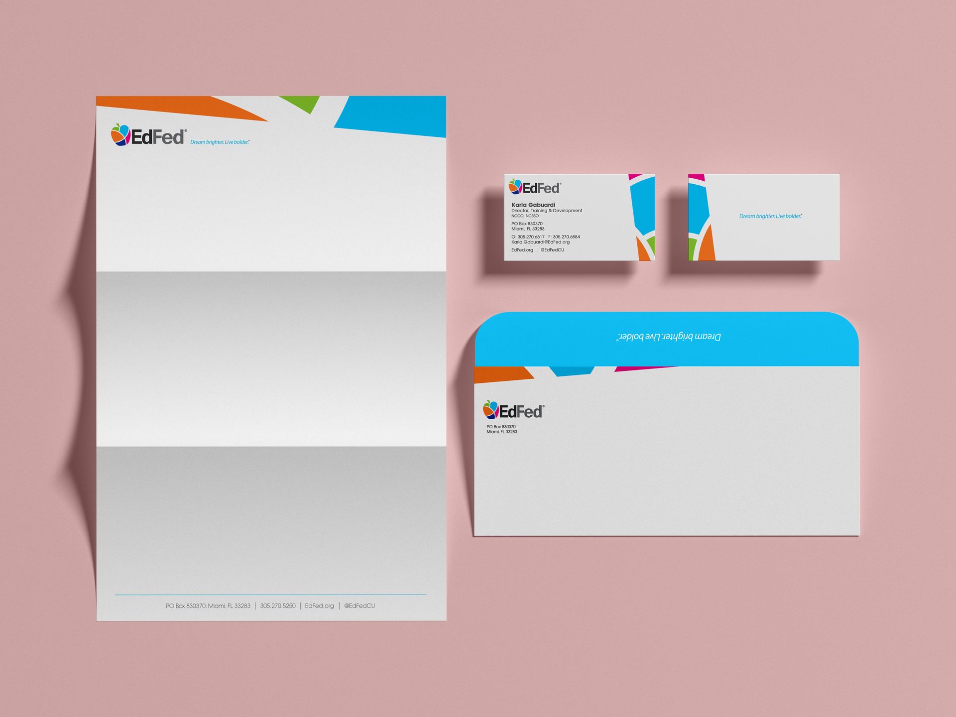
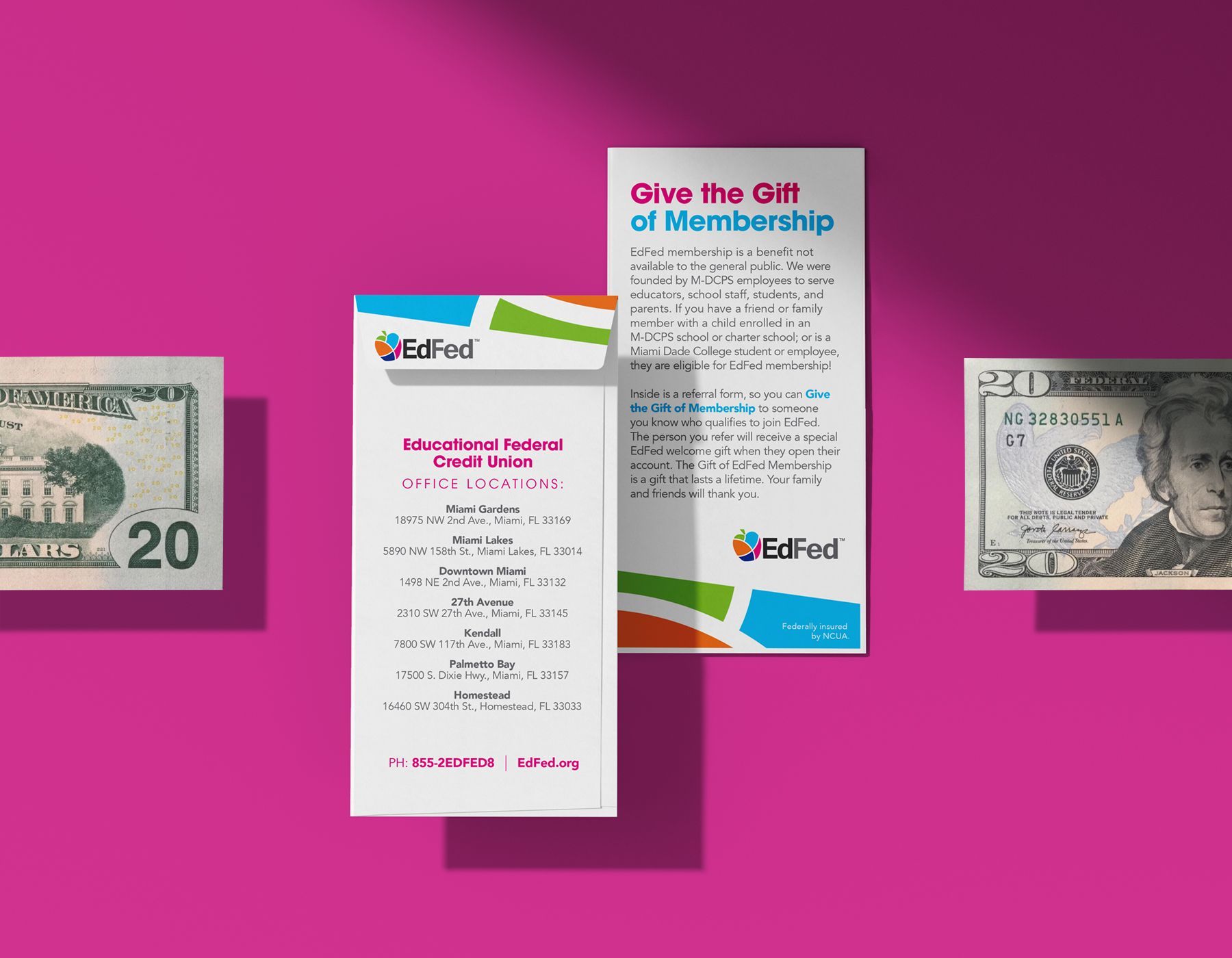
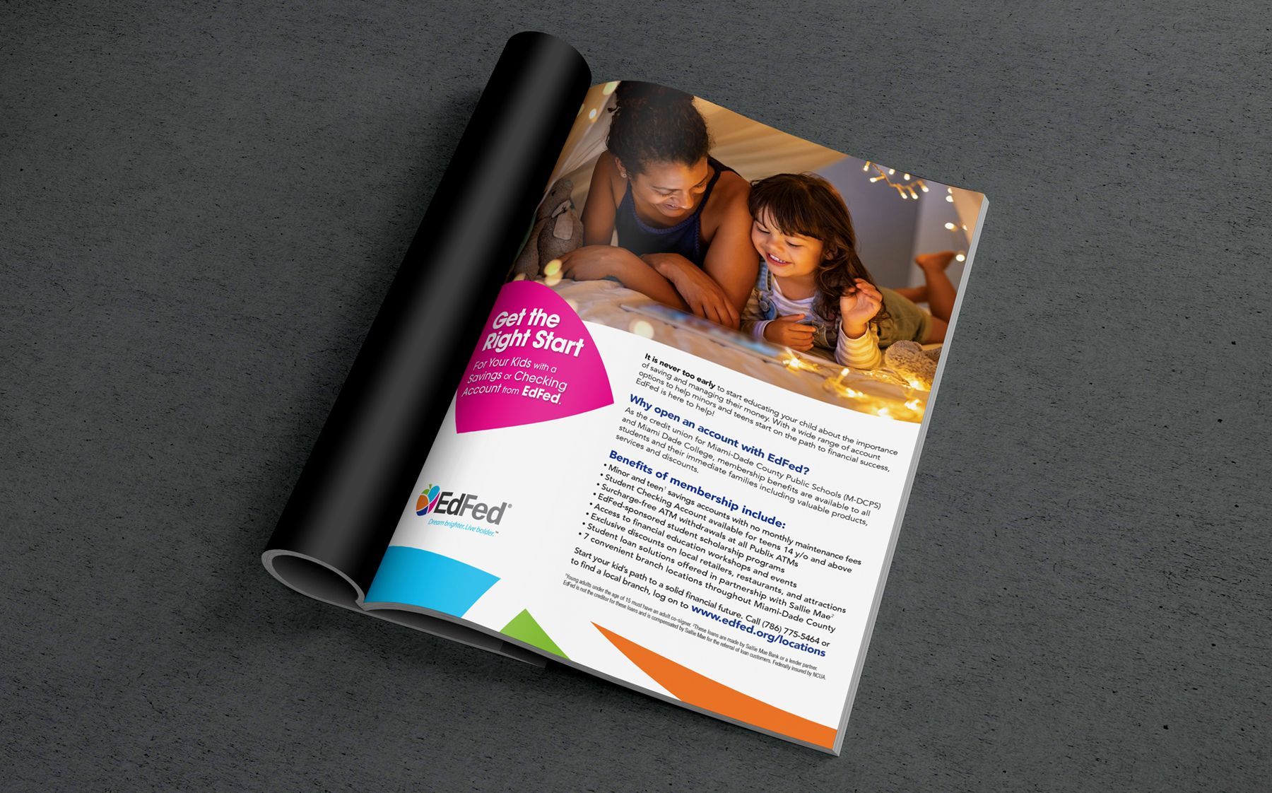
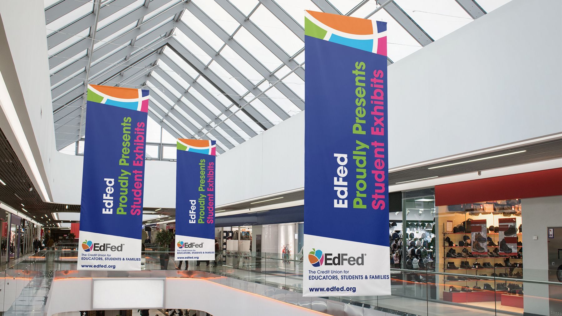
Leftfield opted to retain the iconic apple motif and put a technicolor spin on it – fragmenting the scholastic symbol into a collection of colorful segments to represent the community’s rich cultural tapestry. EdFed was so taken by the result, that they opted to name Leftfield agency of record to spearhead a complete rebrand of the entire institution. From the overhaul of smaller essentials like checkbooks and credit cards, to financial statements, ATM kiosks, and branch internal as well as external signage.
In 2021 and 2022, EdFed became the buzz of the credit union industry when it was awarded two national CUNA (credit union national award) Diamond Awards. The first trophy was awarded for “Category’s Best – Rebrand,” while the second was awarded for “Plastic Access Card Design” for the financial institution’s sleeker credit card production.
